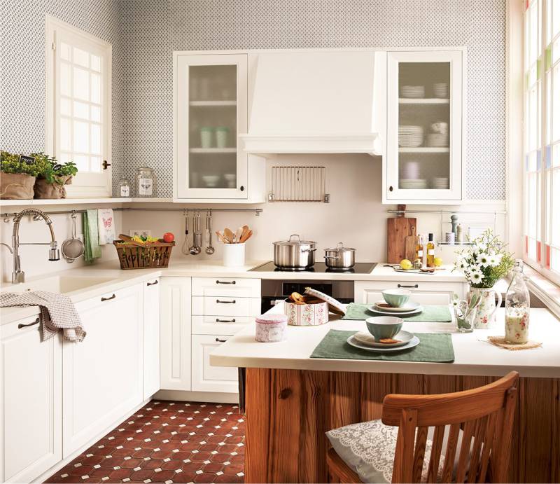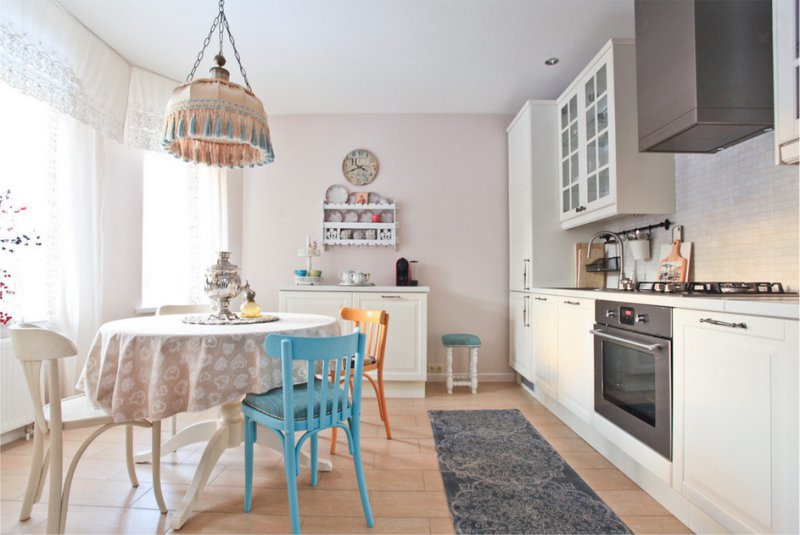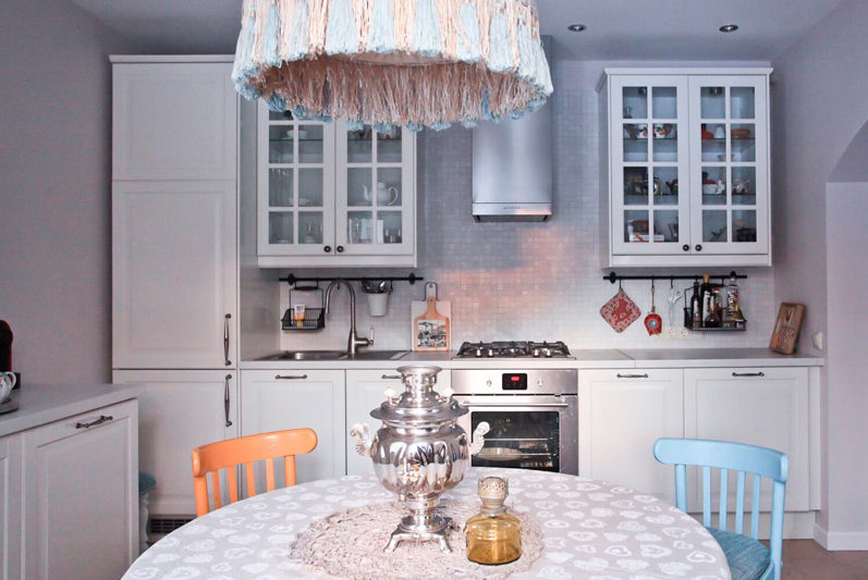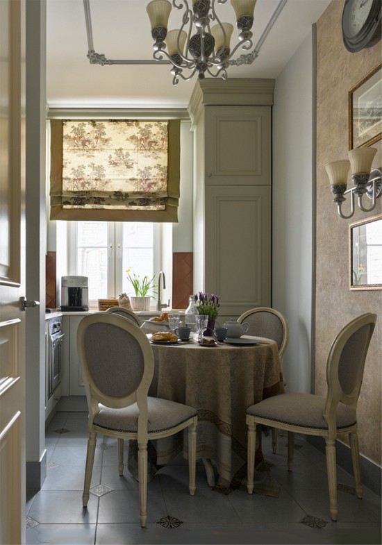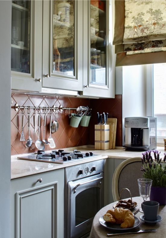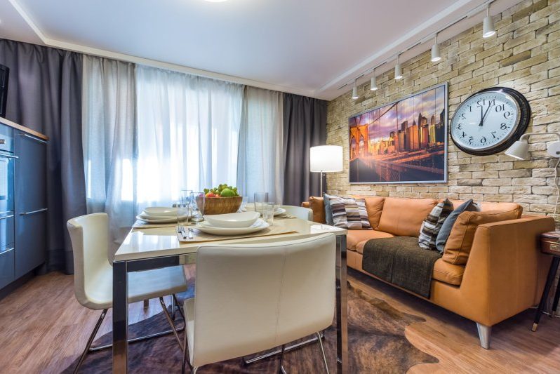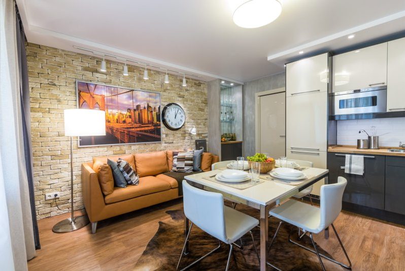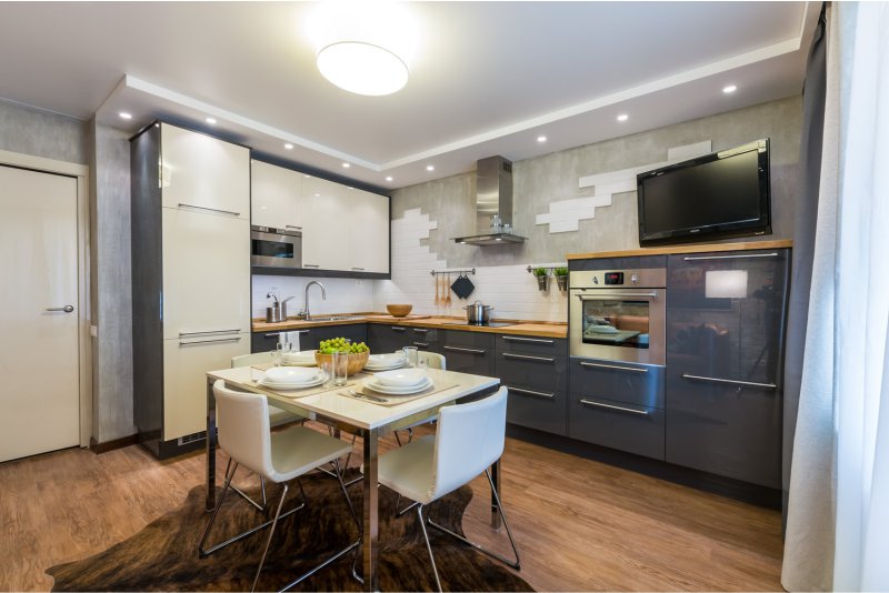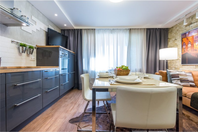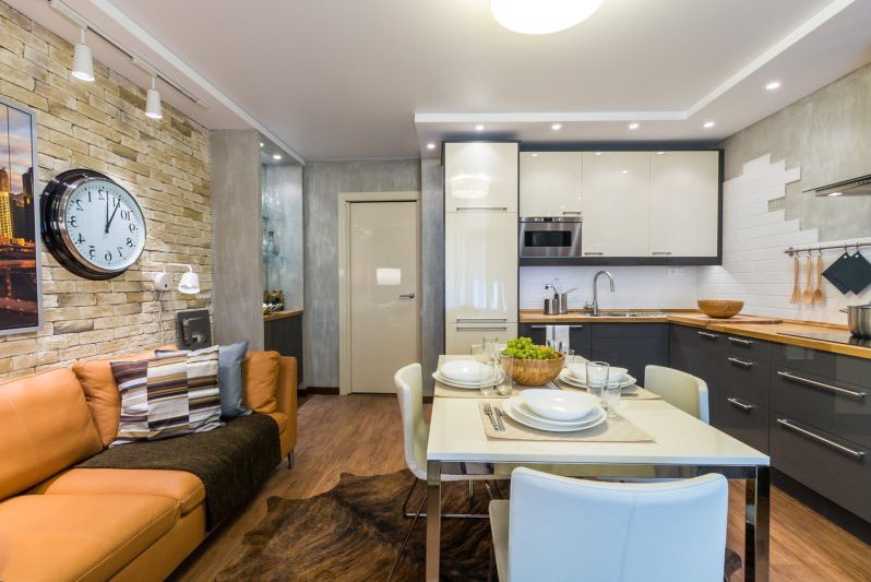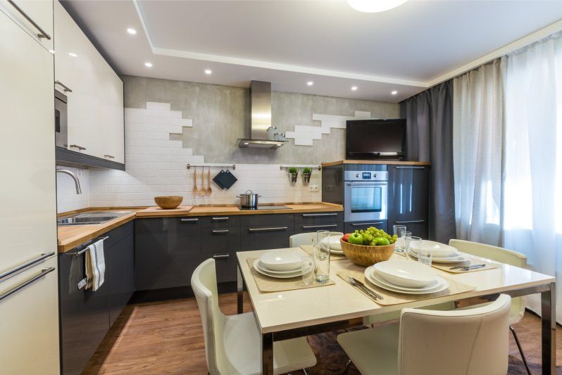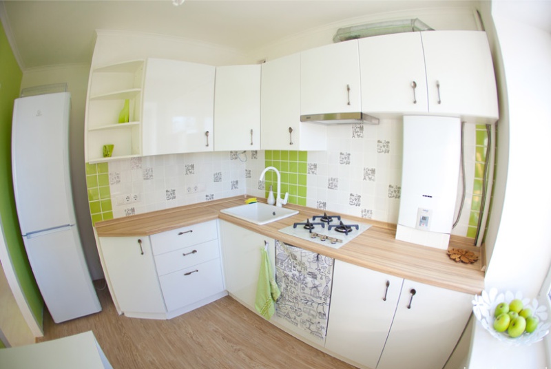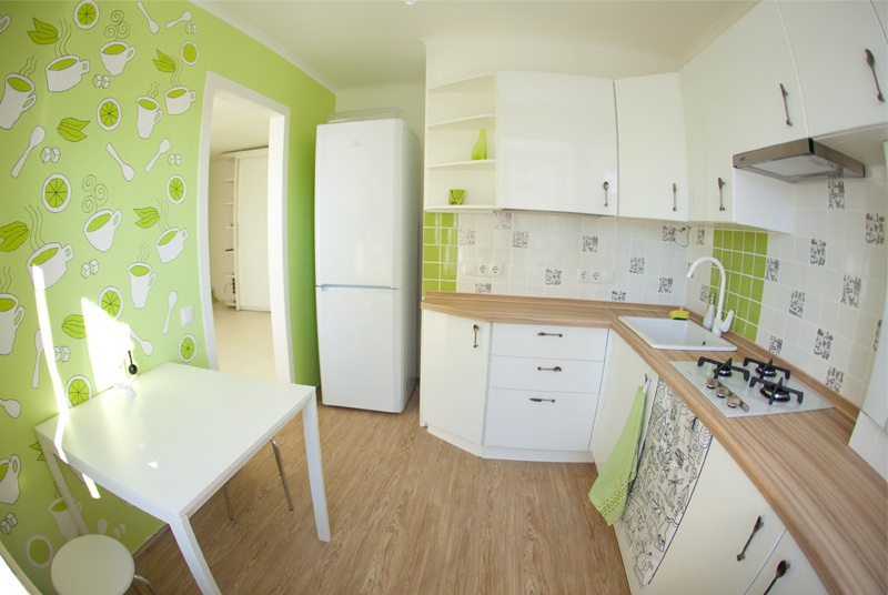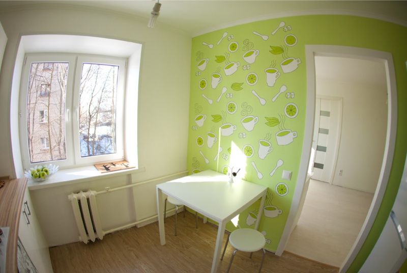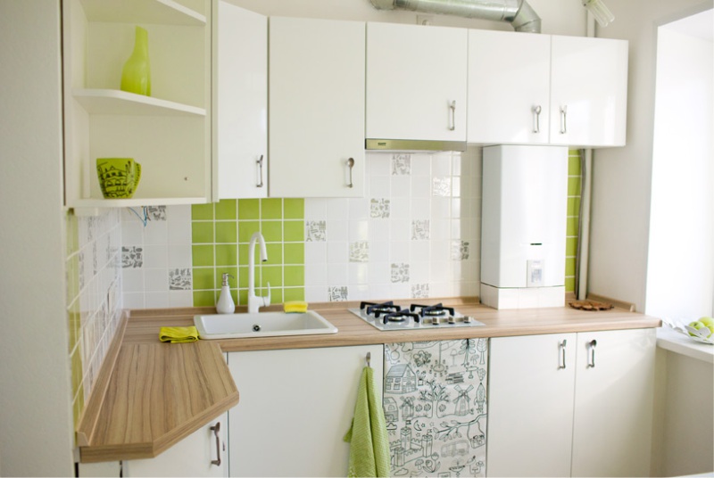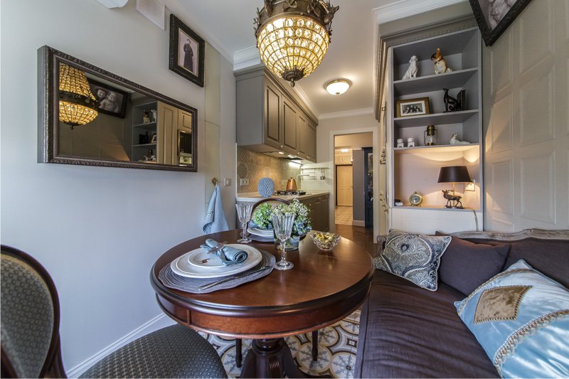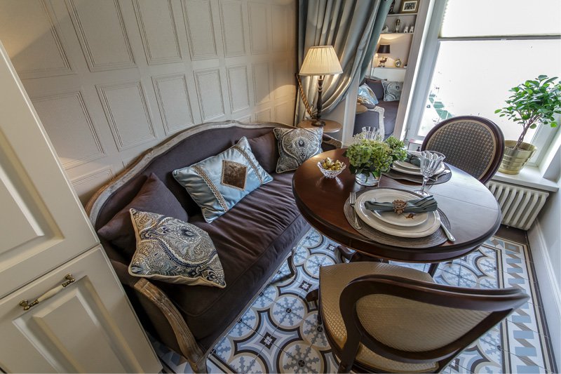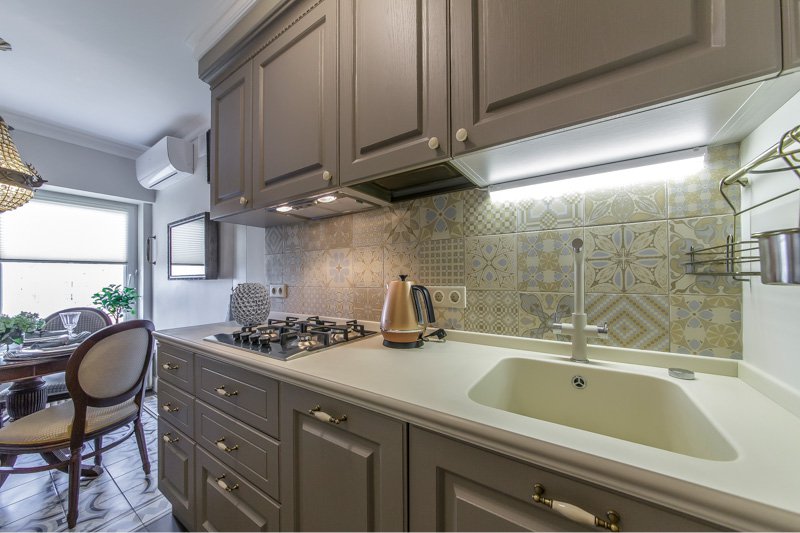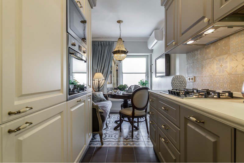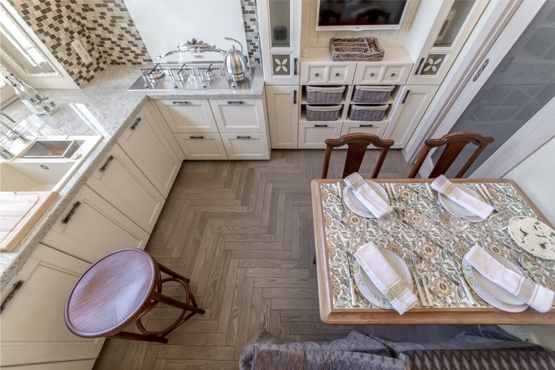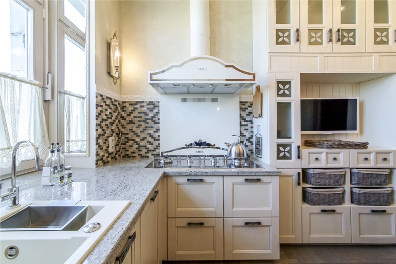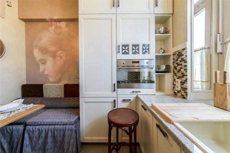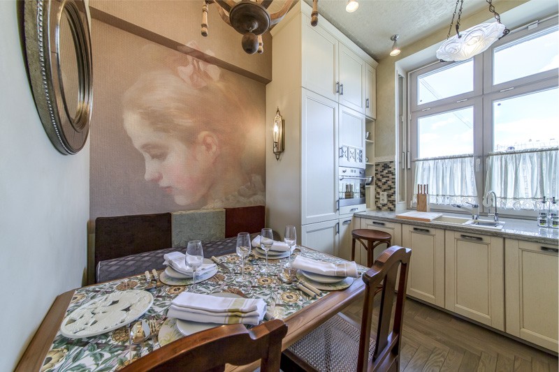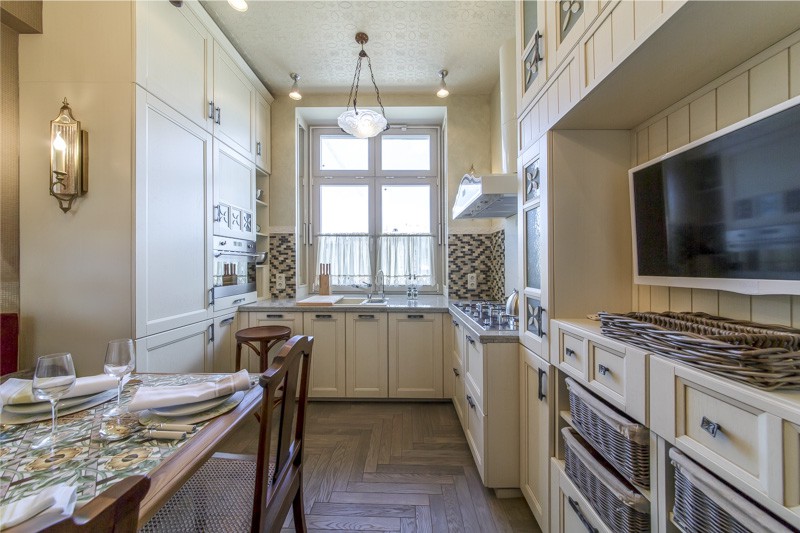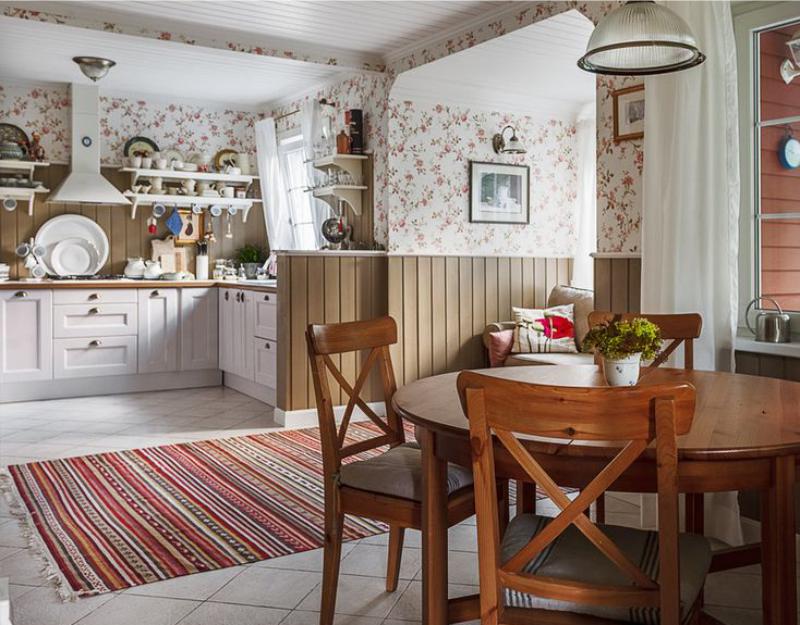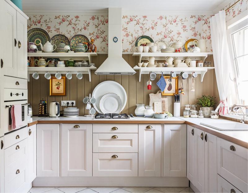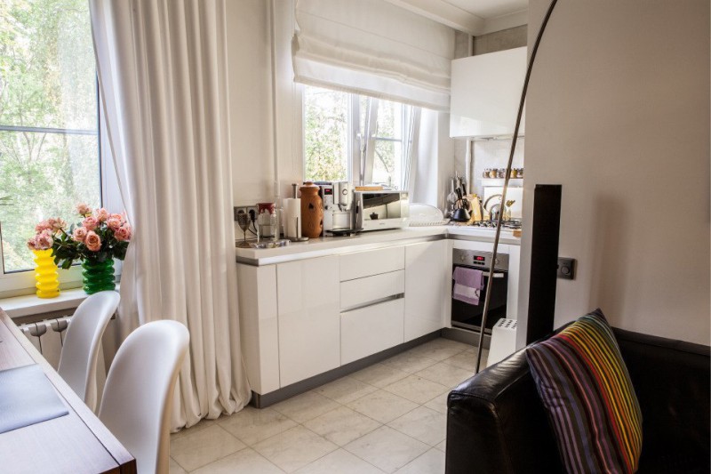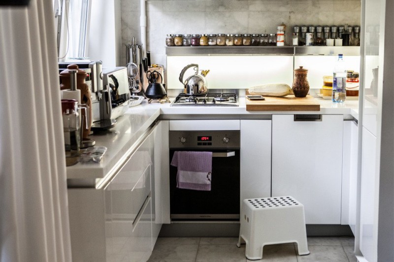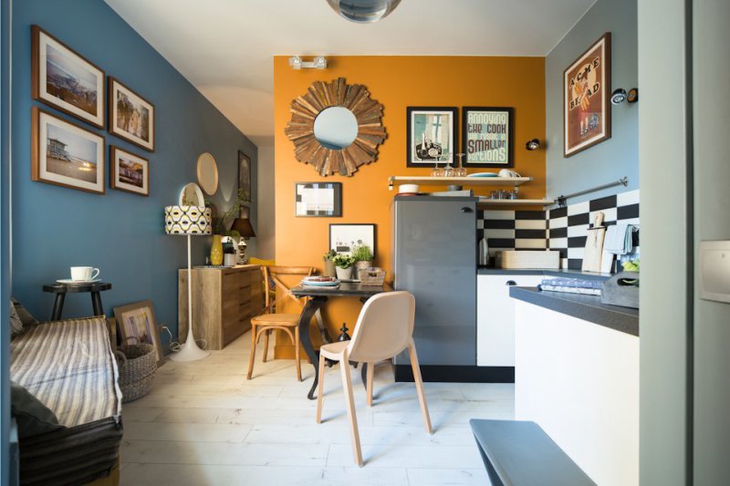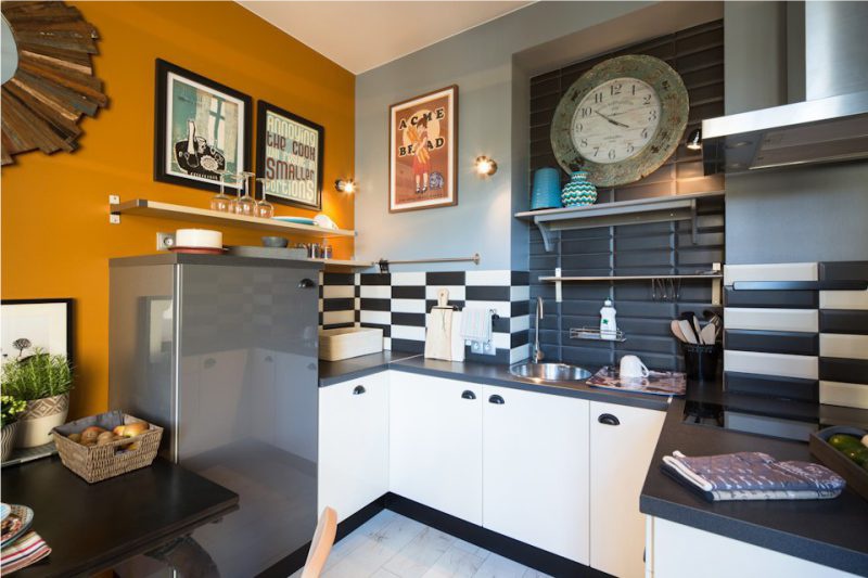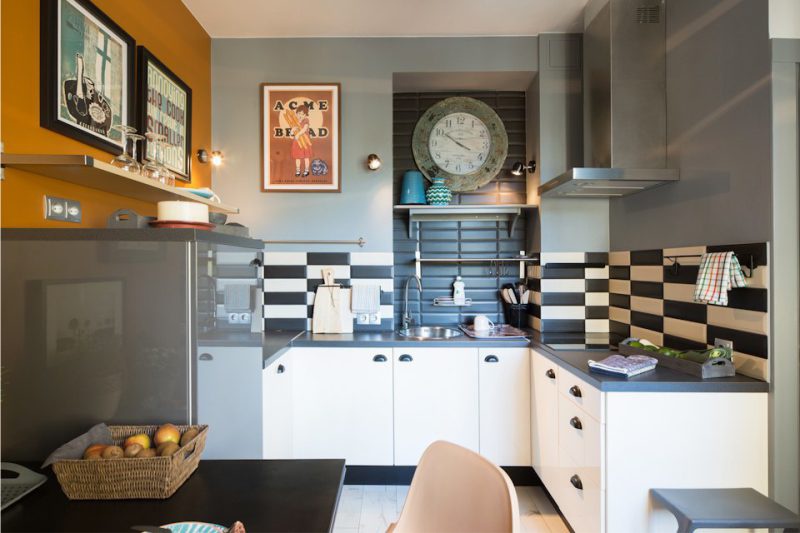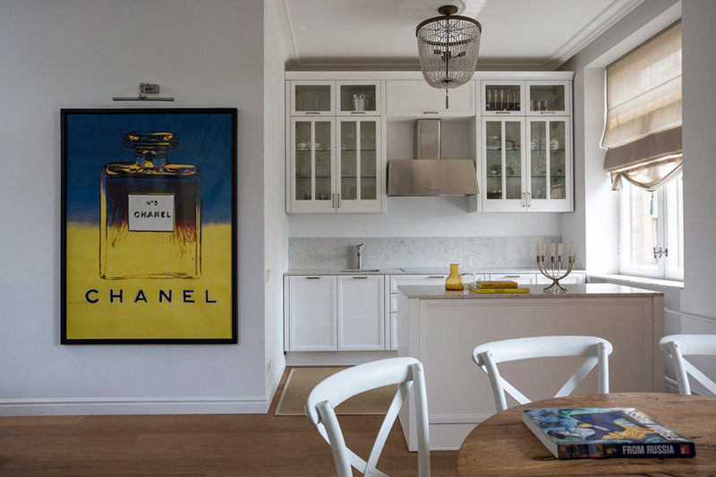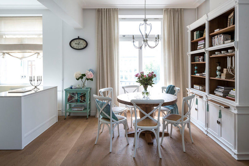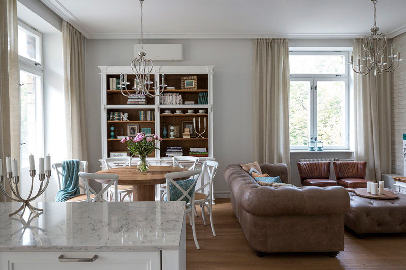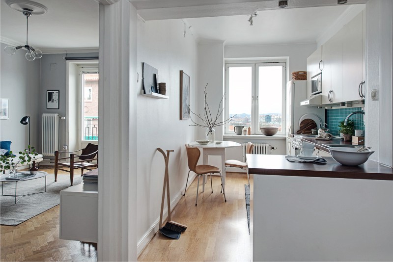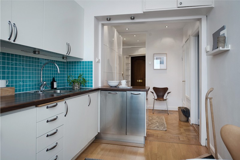
The layout of the kitchen is more than just a layout of furniture and equipment. This project is a significant part of the life of the household, so it is necessary to approach it with all responsibility. Our guide to planning, as well as a selection of 80 clear photo-examples will help you make the right decisions and think over the plan of the kitchen as efficiently as possible.
10 rules of kitchen planning
Before you start creating a plan for a future kitchen, you should familiarize yourself with the basic rules of ergonomics and safety, the standards of furniture sizes and proven design techniques.
- The main rule that should be based on when planning a kitchen is the rule of the so-called working triangle. According to him, the sink, stove and refrigerator should not be located linearly, but in a triangular pattern. It is important that the working points are next to each other – at a distance of not more than 180 cm. Thus, the kitchen script will be the most harmonious: first you get the products from the refrigerator, then carry them to the sink to wash, then the ingredients are cut / mixed and, finally, go to the stove.
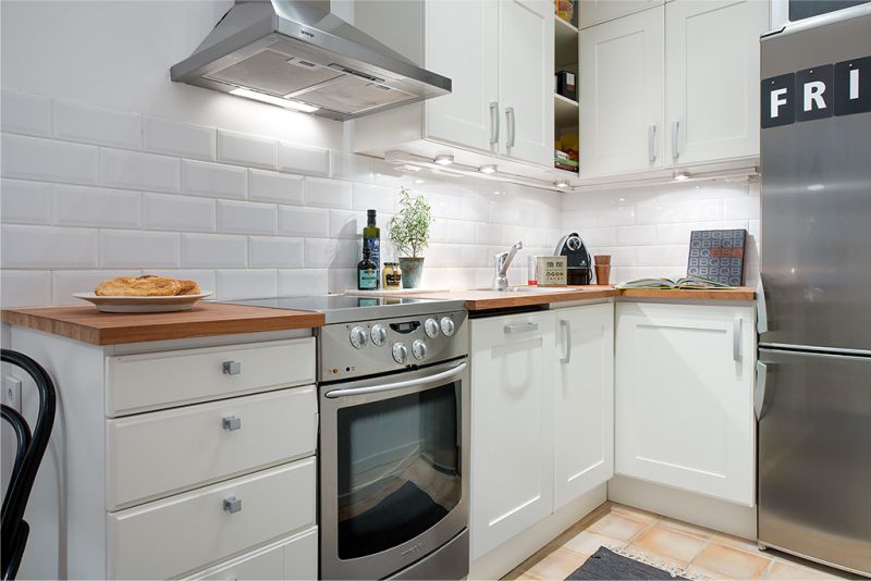
Excess dashes, the expenditure of time and effort, while observing the rule of the working triangle, are minimized
- Planning the kitchen begins with the definition of the place of washing – it should be located within 2.5 m from the riser. Of course, the sink can be rearranged and further 2.5 m, for example, to the window, however in a city apartment this will require at least a slope of the water supply pipe, and as a maximum – the installation of the pump. If you plan kitchen in a private house, it is best to place a sink near the window – so the culinary is nicer, and good for saving electricity. Next to the sink put dishwasher and / or washing machine. Typically, the PMM is placed to the left of the sink, if its user is right handed, and to the right of the sink – if left-handed.
- The next point on the plan is the stove. It should be located at a distance of 40-180 cm from the sink and, of course, closer to the ventilation opening and the gas pipeline, if any. In the interval between the sink and the stove, you can enter the main working surface, where you will cut and mix products. Well, if its length is 90 cm – this is not enough, and not too much. On the other side of the plate there should also be a gap of at least 40 cm wide – this is necessary for safety.
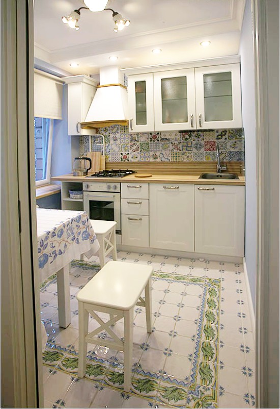
- Important! Placing a plate near a window at a distance of less than 40 cm is not safe and just not practical.
- The minimum width of the passageways in the kitchen should be about 120 cm. In such a “pedestrian zone”, the households will be able to move, without interfering with the cook’s preparation, getting food from the lockers and the refrigerator, and loading the dishwasher. If the kitchen is through, as it often happens in private houses, then the passage should be increased to 130-150 cm. In very small and unsuitable kitchens, 1-meter passages are permissible.
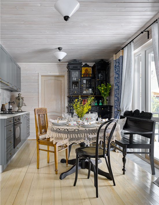
The layout of the kitchen in the private house
- The refrigerator is more convenient to place closer to the sink, rather than to the stove. Also it can be integrated into the unit next to the oven and microwave. With an acute shortage of space, the refrigerator can simply be taken out of the kitchen, say, into the living room or corridor.
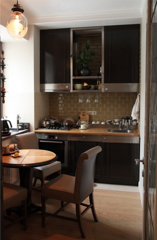
The layout of a small kitchen without a refrigerator
- When planning the kitchen, remember that the projections can almost always be “bypassed” by shallow cabinets, and niches adapt to the storage of things.
If necessary, you can move the doorways, move them a little or expand / cut them. By the way, the door can be removed, rearranged or replaced with a folding / sliding structure.
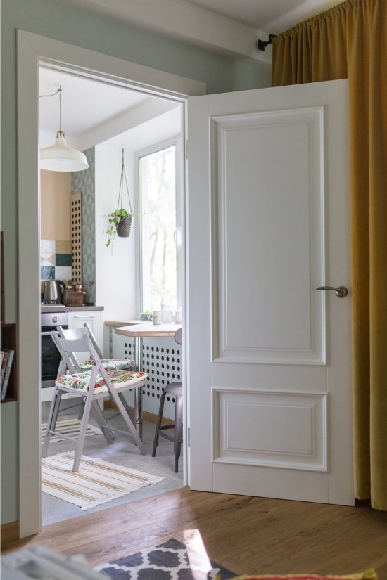
In a gasified kitchen, you can not remove the door, but it can be replaced with a folding / sliding door. You can do it and it’s easier – just rearrange the hinges so that the door opens outwards
- The most convenient way to draw options for planning headset in special programs. For example, simple and free schedulers like Planner5D, SketchUP Pro or on-line IKEA designer are suitable.
- In order to more clearly imagine whether the layout for your kitchen that you have developed is suitable, chalk out the furniture and appliances in full size on the floor and walls. So you can see errors in the plan, resolve doubts or come up with new ideas.
- Keep in mind that to win extra seat when planning a small kitchen you can at the expense of reduced technology: a refrigerator 55 cm wide, a dishwasher 45 cm wide, as well as a washing machine of a reduced depth of 35 cm.
- The layout of the kitchen should take into account the dimensions of the dining area, or rather the rules of ergonomics:
- The width of the seat should be at least 60 cm, and the depth – at least 40 cm;
- From the edge of the table to the wall / furniture should be free space for a chair length of 80 cm;
- The standard chair has a width of 50 cm and a depth of 40-43 cm, a chair with armrests has a large width – about 70 cm.
Types of planning
There are 6 types of kitchen layouts:
- Linear (single-row);
- L-shaped (angular);
- U-shaped;
- Double row (parallel);
- Island;
- The peninsular.
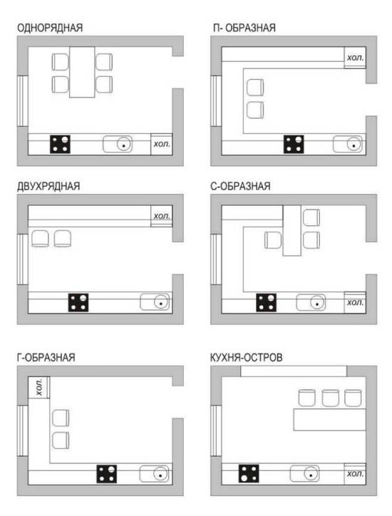
Let’s look at each of these types in more detail.
Linear scheme
Pros: Linear layout of the headset – the most compact, versatile and, moreover, simple in the design, at least due to the lack of corners – and therefore it costs a straight kitchen a little cheaper.
Minuses: This layout option is the most inconvenient, since it violates the rule of the “working triangle”.
Ideal for: very small and narrow kitchens (up to 2 m wide), walk-through kitchens, kitchen studios and kitchen-hallways. Also, the linear layout is suitable for those who rarely and little prepare.
Linear kitchen in re-planned hruschevke
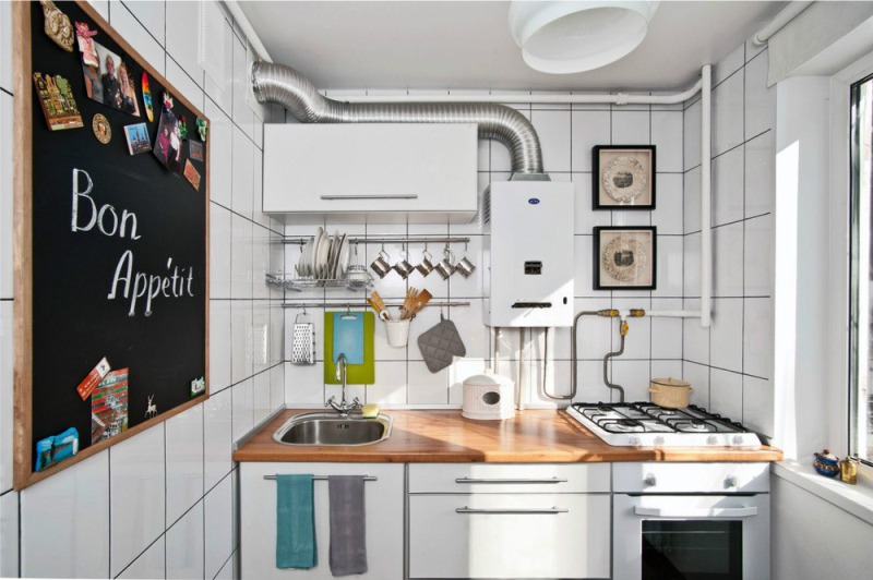
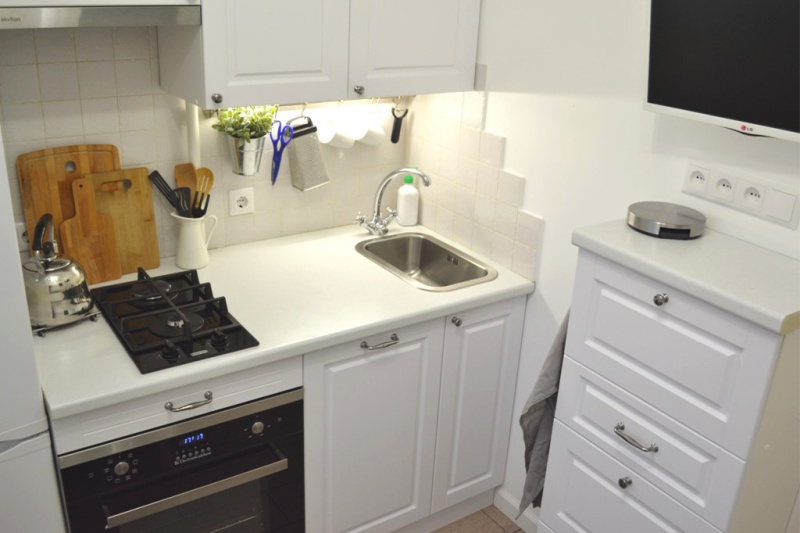
The layout of a very small kitchen
Planning tips:
- To reduce the inconvenience of a direct kitchen, you need to try to plan it so that the sink is in the center between the stove and the fridge.
- To increase the number of storage places, it is necessary to stretch the line-top set to the ceiling.
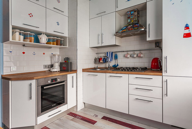
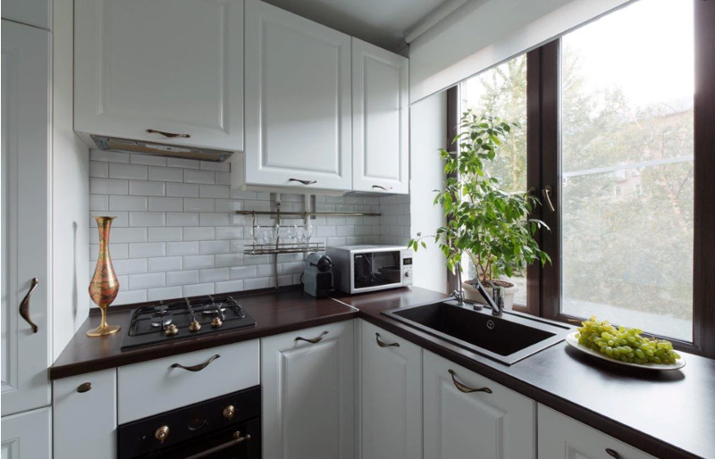
- Often, a straight kitchen can be turned into a corner kitchen, if to combine a set with a window sill and having arranged in it a sink or a working surface, as shown in the following photo-examples.
For more details, see the material: All about planning a straight (linear, single-row) kitchen
L-shaped circuit
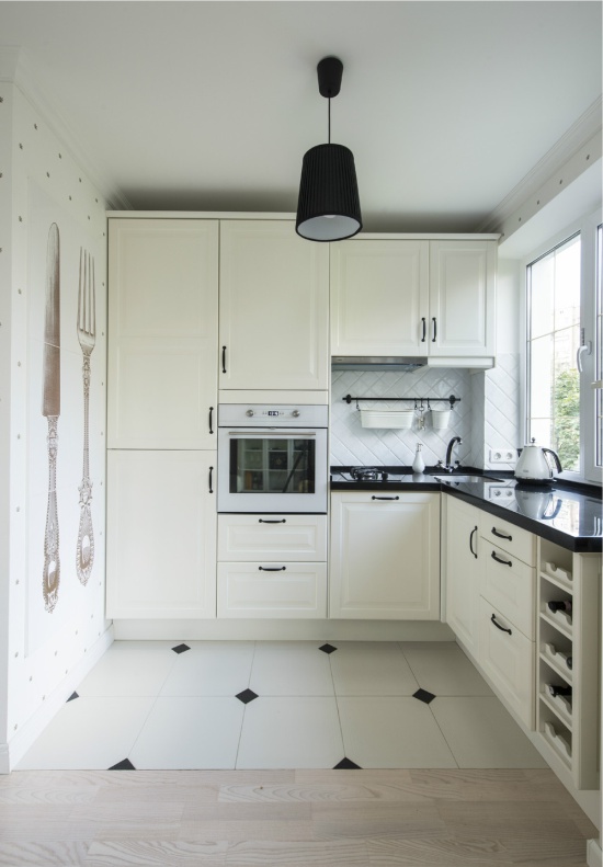
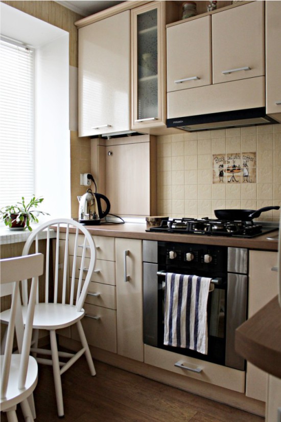
Pros: This layout is good for everyone – it is convenient, versatile, compact and, at the same time, roomy due to the angle involved. The corner kitchen allows you to put a dining table in the center of the room.
Minuses: The L-shaped set is somewhat more complicated and more expensive to design, because the corner module requires additional equipment – a carousel, a drawer or a shelf. If you leave the corner without additional equipment, it will be inconvenient to use it.
Ideal for: Rectangular kitchens, small and medium sized rooms.
Planning tips:
- In a corner it is convenient to build a sink or stove, especially if you make the angle not straight, but beveled.
- Beveled, you can make one of the sidewall headsets (see photo). For example, the one that is located at the entrance – so enter the kitchen will become more comfortable.
Read more: How to plan the perfect corner kitchen
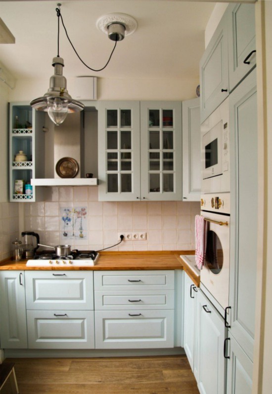
Here are a few photos of small kitchens with an angled layout.
Double-row scheme
Pros: The headset in two lines allows you to create a comfortable “working triangle” and effectively use two walls of a narrow / elongated room.
Minuses: This variant of the layout is convenient only if not too wide and not too narrow aisle – 120-150 cm wide. The second drawback is less safety in comparison with other types of layout, especially if the kitchen is a through passage. In addition, a two-row set can create a sense of tightness.
Ideal for: Extensive and narrow kitchens (with a width of 2.2 m), passage rooms and utilitarian kitchens, in which there is no dining area.
Planning tips:
- It is more convenient, and most importantly safer, to plan the kitchen so that the sink and stove are located in one row, and the refrigerator in the other.
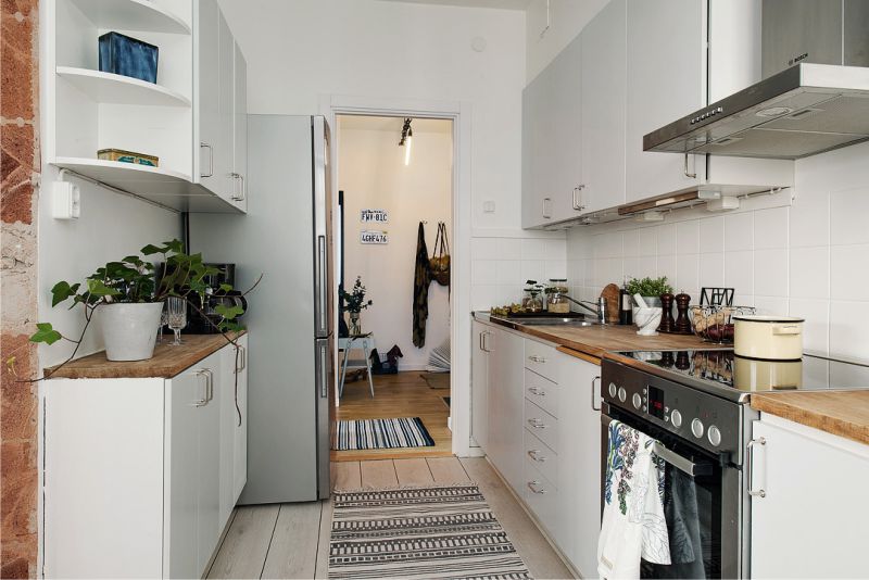
- One of the rows is better to do shorter than the other, then it will be possible to find a place for a dinner table.
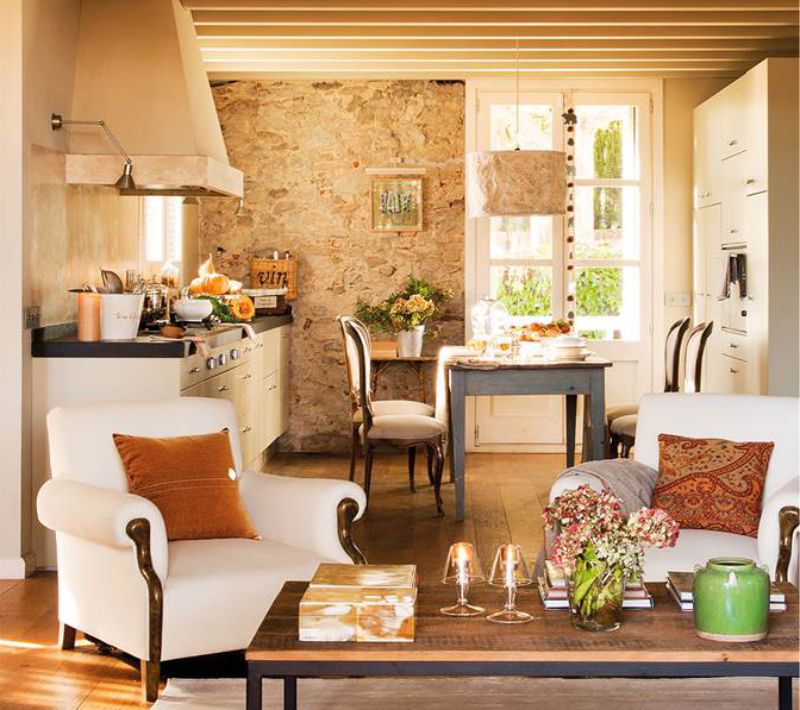
- AT square kitchen two-row layout is also possible, in this case, the dining table is placed in the center, for example, as shown in the next photo.
Below are other photos of interiors of kitchens with a parallel layout.
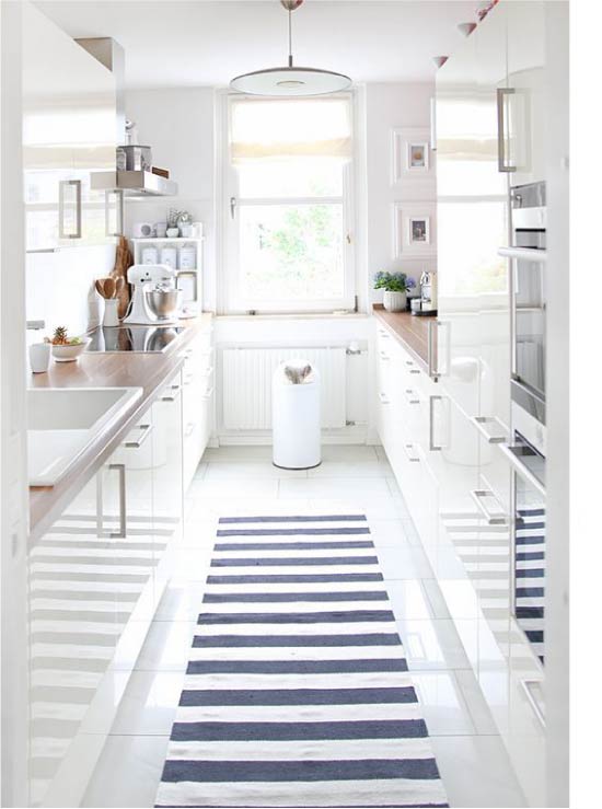
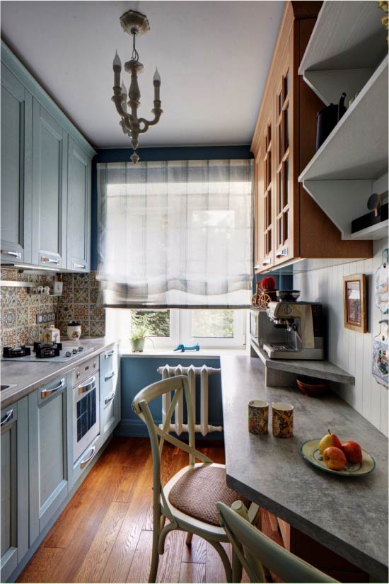
Read more: How to equip a two-row kitchen-galley
U-shaped scheme
Pros: This is the most convenient option of planning, when everything you need is literally at hand. Due to the use of three walls and corners, the U-shaped kitchen is very roomy.
Minuses: The U-shaped set is the most cumbersome and most often requires a large area.
Ideal for: Particularly suitable for square rooms (width from 2.2 m), and kitchens for purely utilitarian purposes, as well as for kitchens, in which often and many are prepared.
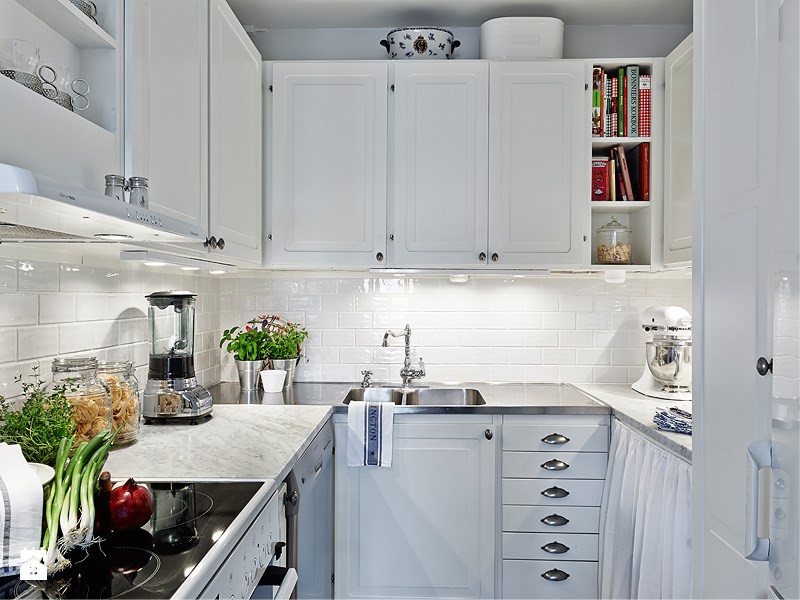
Planning tips:
- U-shaped layout is possible even in a small kitchen in Khrushchev, it is enough only to use a window sill.
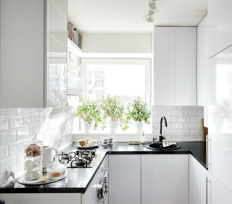
U-shaped layout of a small kitchen
- When planning a U-shaped set, keep in mind that a passage of less than 100 cm and more than 180 cm will make the space uncomfortable.
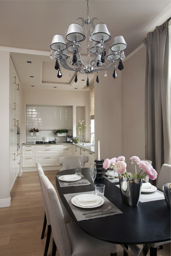
- To visually facilitate the interior of the U-shaped kitchen, leave one or two walls without wall-mounted cabinets.
Read more: How to equip the U-shaped kitchen
Island
Pros: The island will make the kitchen of any layout more convenient and functional. Also, the island can conveniently divide the space, say, into the living room and kitchen or into the working and dining area.
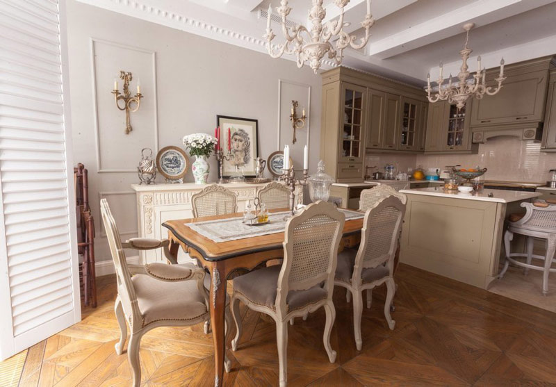
Minuses: Even a small island is possible only in a large kitchen area of 18 square meters. m.
Ideal for: Spacious kitchens and kitchens combined with a living / dining room.
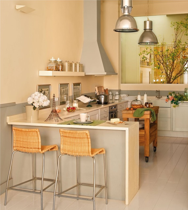
Photo of kitchen layout with mini island
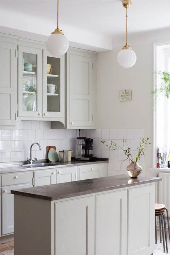
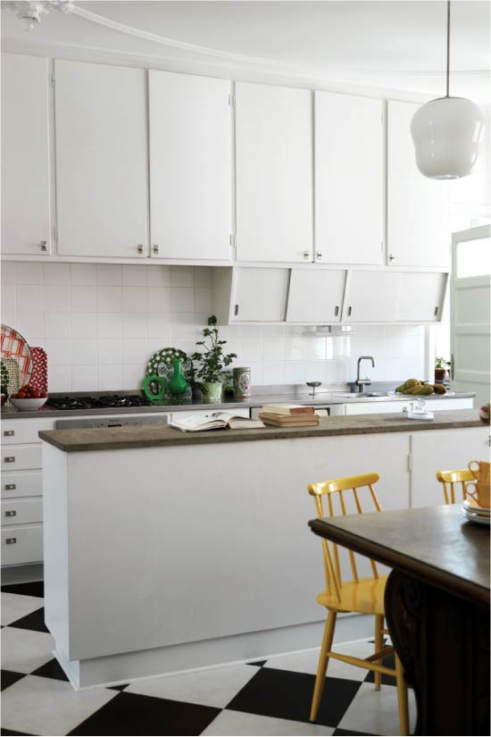
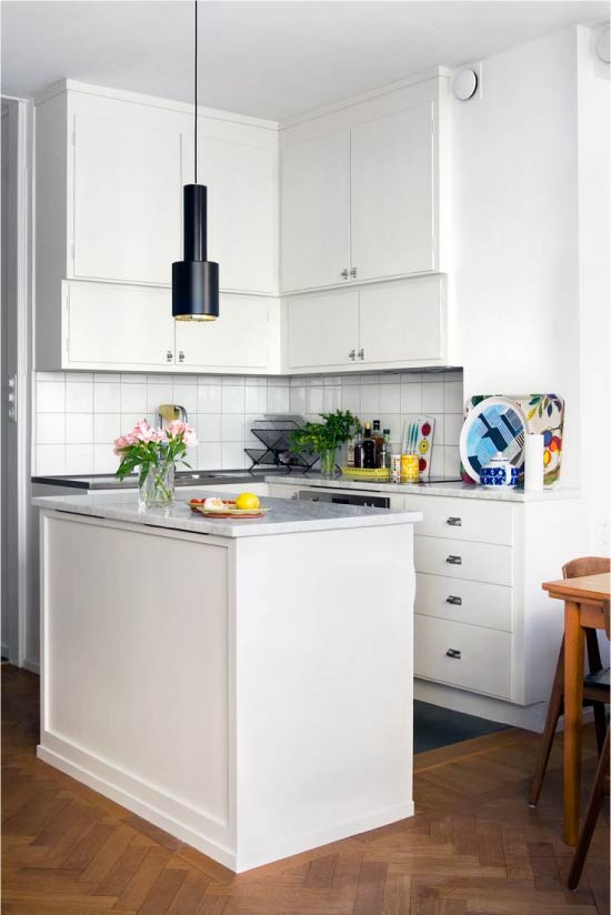
Planning tips:
- The shape of the island must match the shape of the room.
- It is important that around the table-island there are passages with a width of at least 1 meter.
- Well, if the sink is located opposite the island or at all in the island itself.
- Embedding the hob in the island is easier than washing.
More Kitchen with island – all the features of planning and design
Peninsular
Pros: The peninsula also allows you to make the kitchen more convenient and functional, to divide space into zones. However, unlike the island, it is more compact (due to the abutting wall / furniture of one of the ends).
Minuses: Still, “eats” a lot of free space.
Ideal for: Medium and large kitchens, kitchen studios and kitchens combined with a living / dining room.
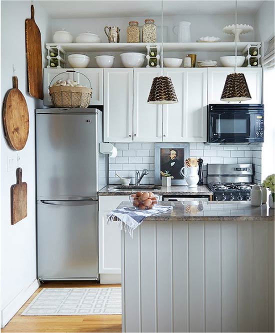
The layout of a small kitchen with a peninsula

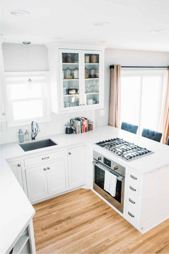
Built-in peninsula with a stove
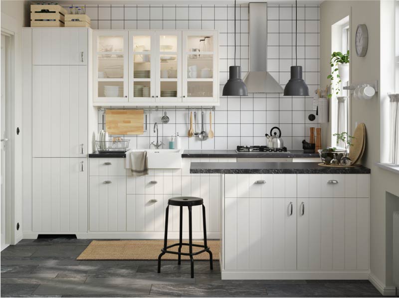
Planning tips:
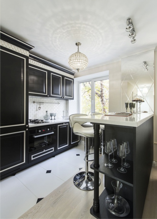
- On the one side of the peninsula it is convenient to equip bar rack. For those who lead a mobile lifestyle, such a peninsula-counter can replace a full-sized dining table.
